If anyone is interested, my "real" blog is at //sixfivesamurai.blogspot.com
Thanks again for all the great feedback this semester!
Tuesday, May 13, 2008
Monday, May 12, 2008
Final thoughts
Well, now that I'm finished with the final project I can reflect on the semester. I really enjoyed this class. The blogging played a large role in this, it was good to put our work up and hear back during the week as we worked. In other classes, I've been in critiques where no one says anything, or barely anything, and you end up with feedback from only the instructor. Selila has great feedback, of course, but it was good to hear what others thought and it's more comfortable a lot of the time expressing yourself in written form and in a somewhat more anonymous manner. Truthfully, I wish we did blogs in all design classes. Even without anyone else viewing the blog, it's valuable as an exercise in self-reflection.
Monday, May 5, 2008
Ad.
Here is a print ad that would run in the Sunday coupon supplement, based on an excellent suggestion Jenny made. Also, Jennifer had a good thought in a comment she made on my last post: maybe I am overusing the 'typewriter' type. In the case of this product, I think it can work to use that type for most of the packaging, since I am going for a bit of a home-made, DIY vibe. In this ad, I started out designing in the one font only but it did feel a bit undynamic. So, I tried something that I thought might complement the original type and the people's organic logo.

(click to enlarge)
Here is the backside of the coffee packaging; again, I mixed in Frutiger (a sans-serif typeface) to avoid overusing the typewriter typeface. Looking at it again, I may need to make adjustments to the green area so that the logo can be seen. Thoughts?


(click to enlarge)
Here is the backside of the coffee packaging; again, I mixed in Frutiger (a sans-serif typeface) to avoid overusing the typewriter typeface. Looking at it again, I may need to make adjustments to the green area so that the logo can be seen. Thoughts?

Sunday, April 27, 2008
label
Ok, I've settled on a logo, and I plan on using the type part of the logo both with the Hand mark and without, as you can see on my packaging. To clarify: this is the front and back of my coffee label (so far). I think the back (R) needs a lot more work. I plan on having nothing on the sides of the bag, just plain brown paper.


Monday, April 21, 2008
new versions of logo
Based on feedback, here are further revisions of the logo (on the bottom row). I think the all lowercase works, while the other does not.

Update: I am really leaning toward going with the logo below, in the slightly heavier weight on the left.


Update: I am really leaning toward going with the logo below, in the slightly heavier weight on the left.
Saturday, April 19, 2008
New logo versions
In response to some suggestions from the blog and in critique, as well as my own dissatisfaction, I have revised the logo. Here are some versions with the text on the right, wrapping the circle, and one with a smaller circle/fist area.
Additionally, I have chosen the "typewriter" style font for these, if anyone prefers another I'll try that too. Camden likes the rounded type from the last post (and I do respect her opinion ;) , but I think it is a little too smooth somehow.
Color suggestions?

(click for larger version)
Additionally, I have chosen the "typewriter" style font for these, if anyone prefers another I'll try that too. Camden likes the rounded type from the last post (and I do respect her opinion ;) , but I think it is a little too smooth somehow.
Color suggestions?

(click for larger version)
Monday, April 14, 2008
Logos.
Here is the logo with some logotypes. The ones with 'coffee' in them are an example of how the product will work into the logo on the packaging. Still haven't locked down my direction color-wise, but I do like the orange and brown as it will be on a brown recycled paper/cardboard box.
I tried some different typefaces that I thought conveyed both organic and 'of the people'.
On the logo circle I used a slight 'roughen' under effect>distort and transform to make it slightly less perfectly circular.
Thoughts?

I tried some different typefaces that I thought conveyed both organic and 'of the people'.
On the logo circle I used a slight 'roughen' under effect>distort and transform to make it slightly less perfectly circular.
Thoughts?

Sunday, April 13, 2008
first logo attempt
Since it's late, I'm just going to throw up the logo I've been working on. I usually like to get more than one version out so people can have some versions to compare and take into consideration, but the others I've started on so far are pretty bad. Not sure about the color yet, I'm just trying hard to stay away from green and some or all of the packaging will be brown paper (similar to grocery bags). The type version below has some 'grunge' type that isn't the in thing anymore, design-wise, but I think in this case it has the potential to work. I may also try a stenciled type, and then some cleaner type to see how that works.


Monday, April 7, 2008
Low-Priced Organic products
After much thought and lack of ideas, I have finally come up with something. My company will be a reasonably priced line of organic products that will be widely available at grocery stores and stores like Target and K-Mart.
The line of products will most likely include coffee, dried fruit and trail mix, granola bars, and other food products. I had first envisioned it as just being a coffee company, but I think people would be interested in buying these other organic products if they could afford them. I'm not interested in competing with the best organic products available at stores like Whole Foods, but in reaching consumers who are generally not targeted for this type of product as they may be priced out of buying organically for economic reasons.
I am strongly leaning toward calling the company "The People's Organic". I need to lean away from over-designing the packaging and identity since it will be for a wide target market. At the same time, I want it to convey "organic", possibly with a simple color palette and using some recycled materials to be easy on the environment with the packaging.
After reading Selila's info PDF, I can say that I am aiming at a mass-market with these products. Things I'll need to consider are: whether the packaging is too expensive to be mass produced at the price point I want to sell at and whether the design will be approachable enough. It will not be easy to convey affordable value.
These organic products have the clean design I'm looking for, though not exactly the color palette I want:

These products from the UK also have a nice clean design:

It seems like everyone uses the color Green as a key color in conveying 'organic', which makes sense, but it's overused. I plan to use typography as my key tool in conveying the nature of my product.
These bags are closer to what I want:

The line of products will most likely include coffee, dried fruit and trail mix, granola bars, and other food products. I had first envisioned it as just being a coffee company, but I think people would be interested in buying these other organic products if they could afford them. I'm not interested in competing with the best organic products available at stores like Whole Foods, but in reaching consumers who are generally not targeted for this type of product as they may be priced out of buying organically for economic reasons.
I am strongly leaning toward calling the company "The People's Organic". I need to lean away from over-designing the packaging and identity since it will be for a wide target market. At the same time, I want it to convey "organic", possibly with a simple color palette and using some recycled materials to be easy on the environment with the packaging.
After reading Selila's info PDF, I can say that I am aiming at a mass-market with these products. Things I'll need to consider are: whether the packaging is too expensive to be mass produced at the price point I want to sell at and whether the design will be approachable enough. It will not be easy to convey affordable value.
These organic products have the clean design I'm looking for, though not exactly the color palette I want:
These products from the UK also have a nice clean design:
It seems like everyone uses the color Green as a key color in conveying 'organic', which makes sense, but it's overused. I plan to use typography as my key tool in conveying the nature of my product.
These bags are closer to what I want:
Tuesday, March 25, 2008
Drawing a blank
I am drawing a blank on a product idea. I'm trying to step out of my confort area and do something that is different and would be challenging, but nothing's come to me yet.
Monday, March 10, 2008
Clipping mask exercise.
I am almost finished with this exercise. First I started with the bottom two words, both of which were not too difficult, having used a clipping mask before. I first placed/created the image and gradient; then added the type. After adding the type, I made both the outline and fill of the letters blank, then selected both the type layer and background image/gradient and went to object>clipping mask>make.
The top exercise was the trickiest, as advertised...I struggled with drawing lines, then creating boxes that I filled with the various colors until I figured out that there is a tool to create a grid. It's grouped under the line tool and looks like a grid. Using the grid tool, I created the grid then used Live Paint to fill in the various boxes with their appropriate colors. After doing that I created the two text boxes with 'Kids' and 'Play' and then joined the two boxes using the Pathfinder tool. Doing that enabled me to use both as a clipping mask, so that when I selected those boxes and the grid and created my clipping mask, both words were used as the mask.
The top exercise was the trickiest, as advertised...I struggled with drawing lines, then creating boxes that I filled with the various colors until I figured out that there is a tool to create a grid. It's grouped under the line tool and looks like a grid. Using the grid tool, I created the grid then used Live Paint to fill in the various boxes with their appropriate colors. After doing that I created the two text boxes with 'Kids' and 'Play' and then joined the two boxes using the Pathfinder tool. Doing that enabled me to use both as a clipping mask, so that when I selected those boxes and the grid and created my clipping mask, both words were used as the mask.
Updated Ibis
Taking some of the suggestions into account, I made some changes for this version. The text boxes are moved away from the rounded background shape, the inside of the body has been lightened to show more of the letterforms, I removed the second star, and I moved the scientific name to under the large 'Ibis'. I think this layout works a little better than the original.


Tuesday, March 4, 2008
National Zoo Poster
I'm about a blog behind on this project.
I started off by hitting the National Zoo site and initially selecting a Porcupine to work with (not for any particular reason, but I thought I'd draw him hanging from a branch). I worked a little bit on this, then came back a week later and realized the porcupine was basically all upper case 'I's used as his "prickles" and decided it wasn't very interesting.
Going back to the site, the animal that grabbed my attention was the Scarlet Ibis. This interesting bird is all scarlett, except for the beak and tail feathers. I started by placing the image I had into my document, then using that as a basis for my illustration I chose a font (helvetica for long clean lines) and began placing letters. My process for this was (over and over): create text box, enter a letter, change to outlines, scale to size, then rotate and put in place. Almost all of my letters are recognizable, except for the upper-case I's I used as the beak, which I warped a bit to make into a beak. Also hard to see are the 'B's I used to indicate the knees- 2 for each knee, places back to back. The eye is a white 'e' behind a black 'c'.

Monday, February 25, 2008
Logo design | Final
After much deliberation and soliciting of opinions, I have decided to go with the circular logo. It has the most versatility in that it is easy to read at all sizes, can be used with almost any color scheme, and evokes 'records' without even having to say "records".
With the circular logo I have chosen, the logo can be used to distinguish different series of records, or time periods in jazz. For example, a series from the 50s could have a black background, while one from the 60s could use orange. This logo is easily recognizable on any background, so it can be seen from far away on a music store shelf (since older jazz listeners might actually frequent a brick-and-mortar store!). It is simple, yet says retro + cool + jazz + records all at once. In it's main form, it has a slight opacity that allows the circular-record portion to blend into the background, though the text stands out with its color.
You can see below one way it could be used on an album cover.
Wednesday, February 20, 2008
Re:Take records: The Pitch
Note: When these were converted to jpeg the blue was changed and is showing up too light and a bit brighter than intended.


As the RE:TAKE customer is knowledgeable of jazz and familiar with the Blue Note, Impulse and Columbia LP covers of the 50s and 60s (examples of which can be seen above), my logo designs are intended to evoke that era. As such, they may echo layouts, typefaces and colorways of that time, as well as hopefully the feeling in general of these LPs.
Concept 1: All text, lowercase Clarendon with Univers Light Condensed. The blue is taken from many jazz releases of the hard bop time-period of jazz, the period most RE:TAKE releases were originally recorded. 'RECORDS' is in the typeface Univers Light Condensed; it is a typeface used heavily during that time and has a retro, cool feel to it. Due to the box outlining TAKE, this logo will be easily recognizable on album/cd covers and in advertising.

Concept 2: This direction uses a circle as a symbol for a record, or LP. When combined with the typeface Clarendon, in all-caps or all lowercase, and the black/white/cool blue colorway, it should be effective in evoking a sense of retro cool in the viewer. One version includes a turntable arm, working further in the direction of symbolizing a record and a player. By using solid black in the background, it will be instantly recognizable by the customer and will stand out from any background.

Concept 3: Another all-type direction, this involves modern geometric shapes, right angles and spacial dimensions of the original LP designs. The logo is transparent in the back, and can be used in many different color combinations to allow it to stand out in various usages and situations.


As the RE:TAKE customer is knowledgeable of jazz and familiar with the Blue Note, Impulse and Columbia LP covers of the 50s and 60s (examples of which can be seen above), my logo designs are intended to evoke that era. As such, they may echo layouts, typefaces and colorways of that time, as well as hopefully the feeling in general of these LPs.
Concept 1: All text, lowercase Clarendon with Univers Light Condensed. The blue is taken from many jazz releases of the hard bop time-period of jazz, the period most RE:TAKE releases were originally recorded. 'RECORDS' is in the typeface Univers Light Condensed; it is a typeface used heavily during that time and has a retro, cool feel to it. Due to the box outlining TAKE, this logo will be easily recognizable on album/cd covers and in advertising.
Concept 2: This direction uses a circle as a symbol for a record, or LP. When combined with the typeface Clarendon, in all-caps or all lowercase, and the black/white/cool blue colorway, it should be effective in evoking a sense of retro cool in the viewer. One version includes a turntable arm, working further in the direction of symbolizing a record and a player. By using solid black in the background, it will be instantly recognizable by the customer and will stand out from any background.
Concept 3: Another all-type direction, this involves modern geometric shapes, right angles and spacial dimensions of the original LP designs. The logo is transparent in the back, and can be used in many different color combinations to allow it to stand out in various usages and situations.
Logos Pt. 2
I have narrowed down to a few variations now. I tried the turntable arm with the circular designs but it just looked too detached to really hold together as a logo, so that is out. Of these my favorite is actually the one on the bottom right, inside the box. I still like the ones in the circle though.

Sunday, February 17, 2008
First set of logos

This is my first set of logos. I used the slab-serif typeface Clarendon, as I think that evokes the right time-period and has been used for many jazz covers in the past. Colorwise I went with a simple scheme of black/gray/light blue/and possibly working in some orange. (click image to view at 100%)
First notes + sketches

I listed out some of the symbols I might be able to use to evoke jazz and the time-period where most of the releases would be from, along with some basic sketched ideas for the logo. (click on photo to see the whole page)
Monday, February 11, 2008
Logo design/Brand Identity project.
For the brand identity project, I am designing a logo for the record label RE:TAKE Records. RE:TAKE specializes in re-issuing jazz records from the 50's and 60's on cd, vinyl and digitally. There are many "lost recordings" of both live and studio sessions that are of great interest to the jazz fan. RE:TAKE searches for these recordings and re-masters them to produce high-quality releases. The typical customers are jazz afficionados of all ages, though the audience tends to be older and mostly male. As an afficionado this customer is extremely knowledgeable on jazz and RE:TAKE wants to be the label this customer looks for when they look for music to purchase. Their mission statement is: "To mine the archives of lost jazz recordings to restore treasures in digital clarity".
RE:TAKE is a small company and has a specific focus; also small is their audience who is familiar with what they do. Due to their smaller audience they don't have to advertise themselves extensively, other than ads in jazz and other music magazines for specific releases. They want a logo that they can use in color and b/w for album packaging and also on the web. They want a logo that is modern, yet has a retro feel evoking the era of classic jazz from the 50s to 60s.

RE:TAKE is a small company and has a specific focus; also small is their audience who is familiar with what they do. Due to their smaller audience they don't have to advertise themselves extensively, other than ads in jazz and other music magazines for specific releases. They want a logo that they can use in color and b/w for album packaging and also on the web. They want a logo that is modern, yet has a retro feel evoking the era of classic jazz from the 50s to 60s.
Monday, February 4, 2008
Turning a letter into another letter, pt. 2
I finished turning the 'G' into a 'd'. By adding extra points, I was able to fine-tune the serif area on the ascender to make it match fairly well the actual area on the Garamond 'd'.

vector artwork

From You Work For Them. This is from a set of cityscapes in vector form, including skyscrapers, overhead views and street layouts. As a fan of big cities and illustration, these are right down my alley. I like how hand-done they appear to be, while they can be resized, of course, and blown up big and the colors can be adjusted.

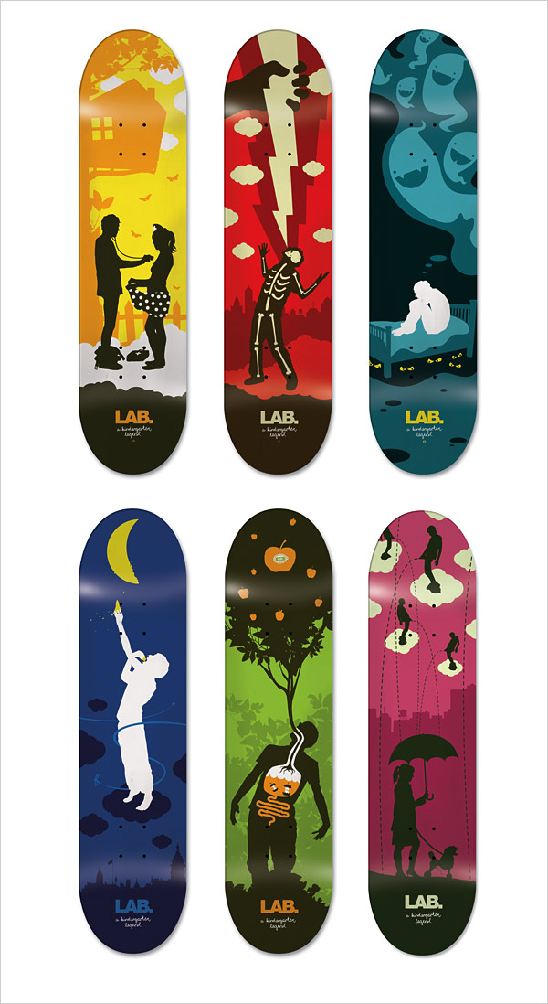
As a former skateboarder, I love these graphics designed by Emil Kozak, a designer from Denmark. As you can tell, I prefer flatter artwork and silhouettes, not the 3-d stuff as much... (go print!)

I do like some 3-d stuff; this work is by a Russian artist, Maria (last name I couldn't find). Though some of her work borders on cheesy sci-fi/fantasy novel covers, there is also much that is really impressive and moving. The difference between this style and the flatter styles in the previous examples shows the wide range of work that can be produced using vectors in Illustrator.
Monday, January 28, 2008
Turning a letter into another letter.
Notes
Starting with an uppercase Baskerville 'G'.
Thinking of turning it into a lowercase 'd', so I will remove some points on the right side and then work on turning it into the d.
Using delete anchor point tool to delete some anchor points.
Not sure how to joint the two open sides of the G to make it into the d which is a closed letter..there may be some options that include the scissor or eraser tool, but I am going to try to select some of the points involved and then use object>path>join. So far that is not working for me. I m now using the scissors tool to try and cut the end of one side off, though that is probably not the best or neatest way to go.
Scissors tool worked fairly well and it looks neat, but I'm sure there was a better way to do it by somehow joining the two areas.
Getting close to finishing the 'd' now, just need to complete the top..
Subscribe to:
Posts (Atom)
